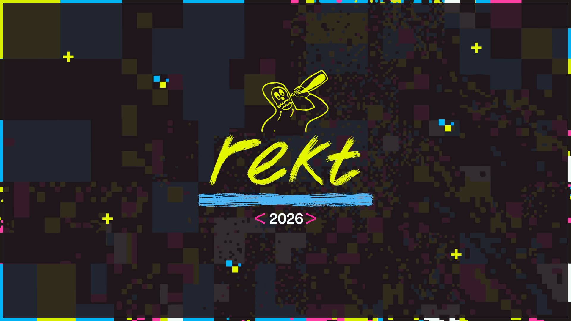
Rekt Brand Guidelines
Guidelines V001
Updated · Q1 2026
Welcome to the
Rekt Brand
Guidelines
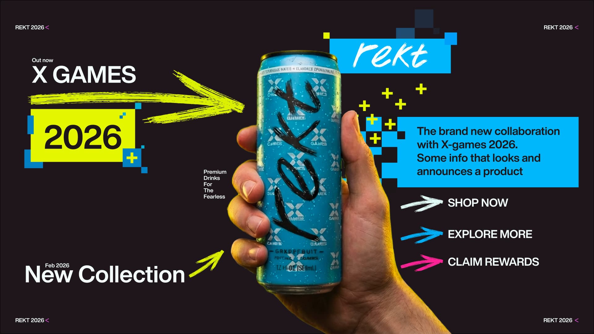
Rekt is built to cut through the noise. Our brand is sharp, unapologetic, and impossible to ignore. Every element, from color to type to tone, is designed to hit hard and stick.
This is a guide, not a rulebook. These principles exist to keep Rekt's voice strong, unified, and intentional while giving you the space to push the brand forward.
Contents
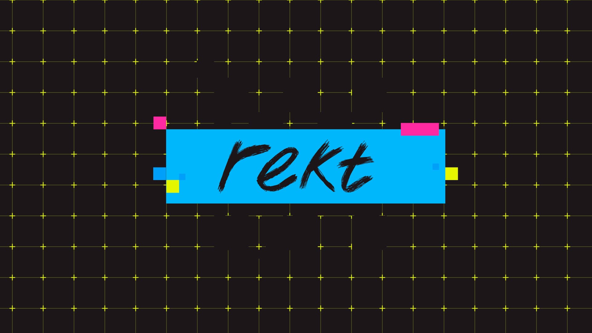
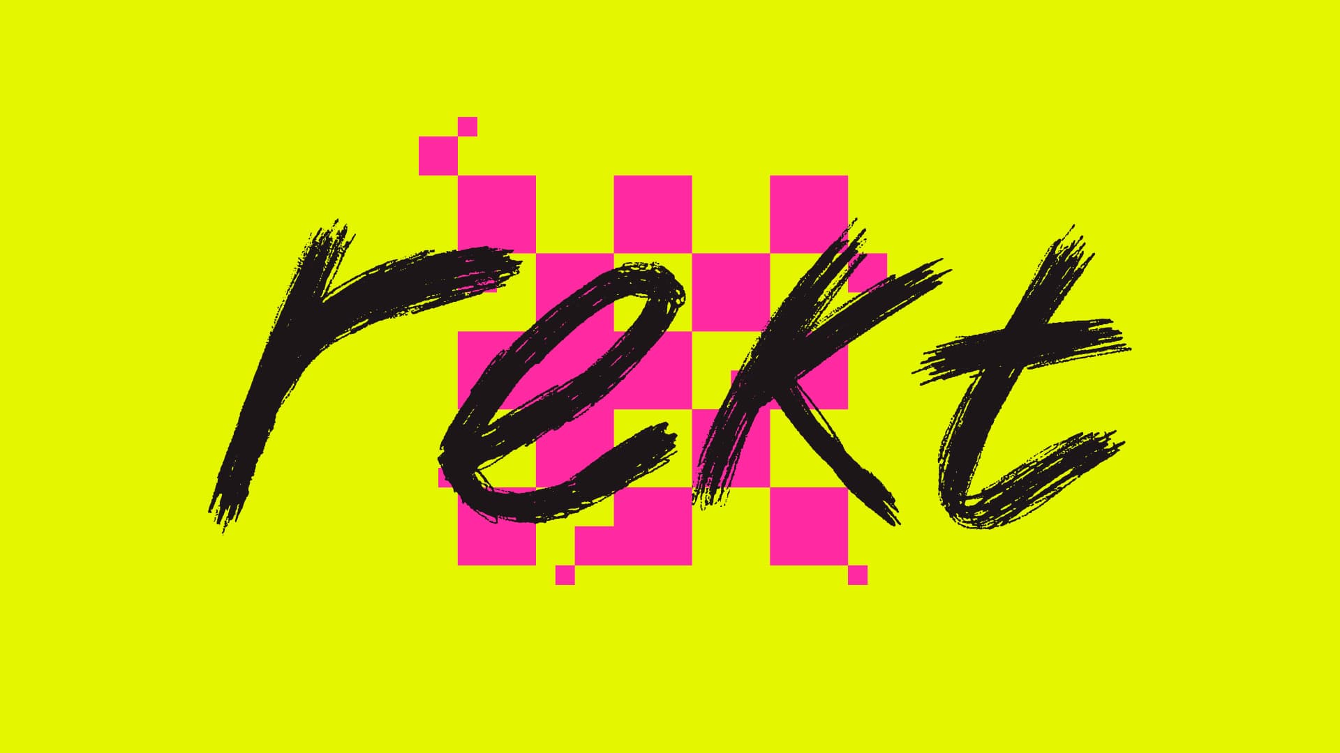
Logo
Primary Logo
On light backgrounds
On dark backgrounds
Symbol
On light backgrounds
On dark backgrounds
Usage Rules
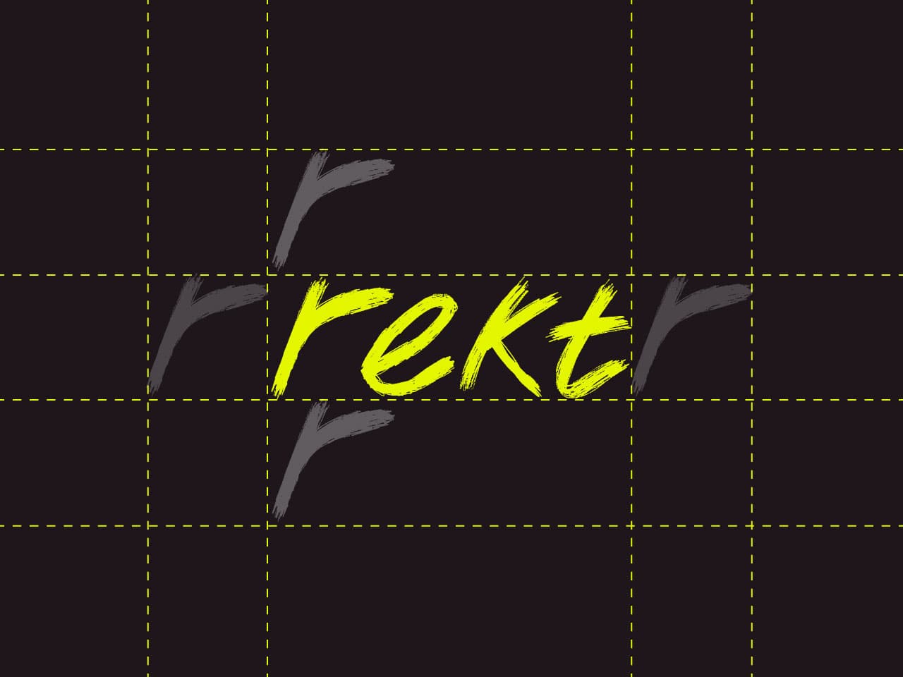
Clear space. Maintain "r" height on all sides.
Minimum sizes
Typography
Primary Typeface
Helvetica Now Display
Bold
Uppercase
ABCDEFGHIJKLMNOPQRSTUVWXYZ
Lowercase
abcdefghijklmnopqrstuvwxyz
Numerals
0123456789
Symbols
!@#$%^&*()_+-=[]{}|;:'",.<>?/~`
Attention-Seeking Header
Anton Italic
Use sparingly for loud campaign-style moments, hero statements, and high-impact brand headers. Do not use for body copy or dense UI.
Type Hierarchy
Attention-Seeking Header
Anton Italic
Uppercase
Tight / compressed / 96px+ / display
SEEK ATTENTION
Headline
Helvetica Now Display Bold
Uppercase
Tracking wider / 48px / 5xl
HEADLINES BUILT TO HIT HARD. DESIGNED FOR MAXIMUM IMPACT ACROSS EVERY TOUCHPOINT.
Headline 2
Helvetica Now Display Bold
Sentence case
Tracking normal / 48px / 5xl
Secondary headlines use sentence case for a more conversational tone while still commanding attention on the page.
Subhead
Helvetica Now Display Bold
Sentence case
Tracking tight / 30px / 3xl
Subheads support the headline with context. They carry weight without competing for attention, guiding the reader deeper into the content.
Body
Helvetica Now Display Bold
Sentence case
Normal / 18px / lg
Body text delivers the details. It should be clear, direct, and easy to scan. Every sentence earns its place. No filler, no fluff. The brand voice stays sharp even at smaller sizes.
Caption
Helvetica Now Display Bold
Uppercase
Tracking wider / 11px / xs
CAPTIONS ARE USED FOR LABELS, METADATA, AND SUPPORTING DETAILS ACROSS THE INTERFACE.
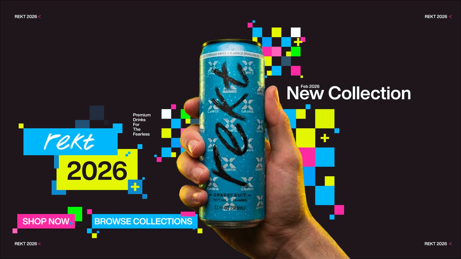
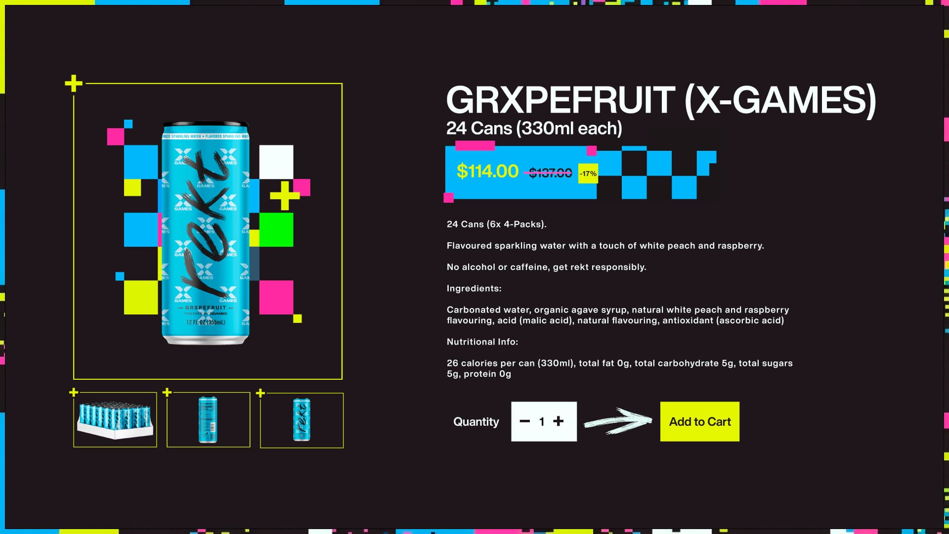
Color
Primary Colors
The core of Rekt's visual identity. Yellow on deep black is the signature combination. White is used sparingly for contrast.
Accent Colors
Supporting colors used for highlights, data visualization, product variants, and editorial moments. Never compete with Yellow for primary attention.
Neutrals
Used for UI surfaces, borders, and secondary text. These create structure and breathing room.
Proportion
Black dominates as the primary surface. Yellow cuts through for brand recognition. White, cyan, and magenta are used equally as supporting colors. Accents are applied sparingly to maintain impact.
Color Combination
Aim for high-contrast pairings that maintain clarity and focus. Keep compositions tight. Three or fewer colors is ideal. These approved combinations ensure visual balance and impact.
Brand Usage
Correct colors
Use the logo in approved brand colors only
Adequate clear space
Maintain minimum clear space around the logo
High contrast
Ensure sufficient contrast between logo and background
Don’t distort
Never stretch, skew, or rotate the logo
Don’t recolor
Never apply unapproved colors or gradients to the logo
Don’t crowd
Never place the logo too close to other elements
Tone of Voice
Bold. Direct. Unapologetic.
Speak with confidence. Be punchy. Use active voice. Keep it short.
Be vague, overly formal, or generic. No corporate jargon. No filler.
Primary Logo
svg
Rekt Character
svg
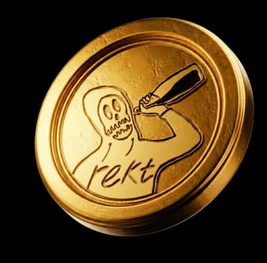
Rekt Coin
webp
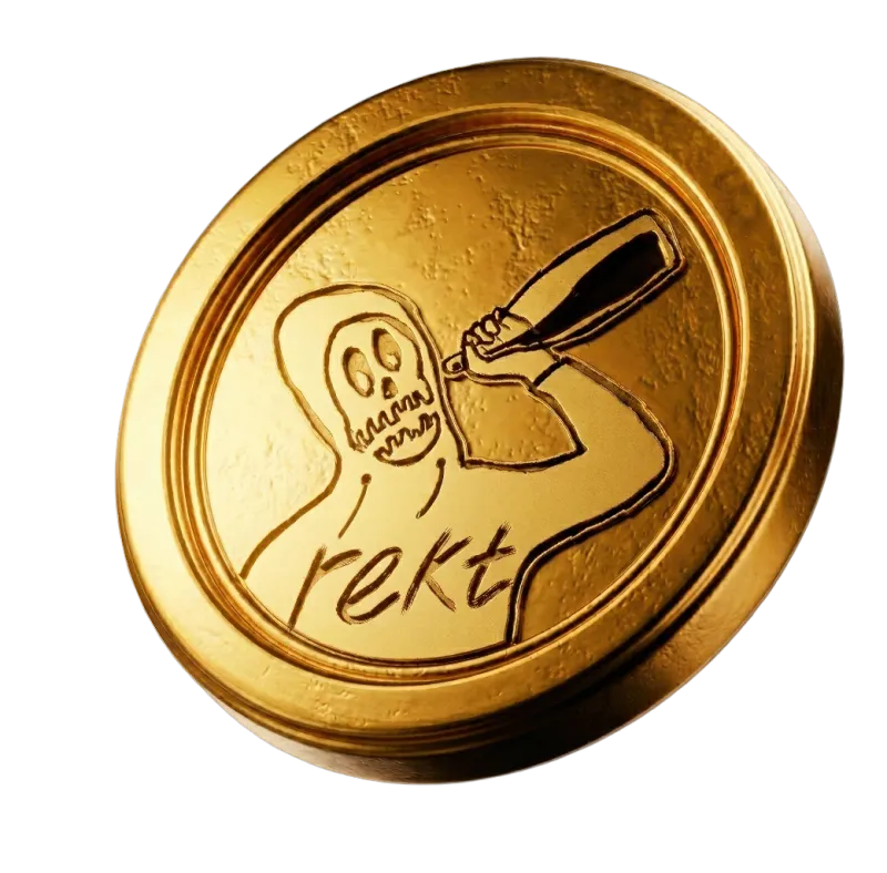
Arrow Element
svg

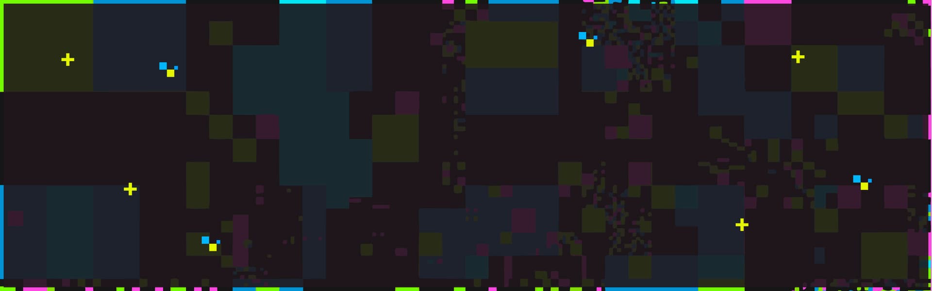
Mosaic Pattern
svg

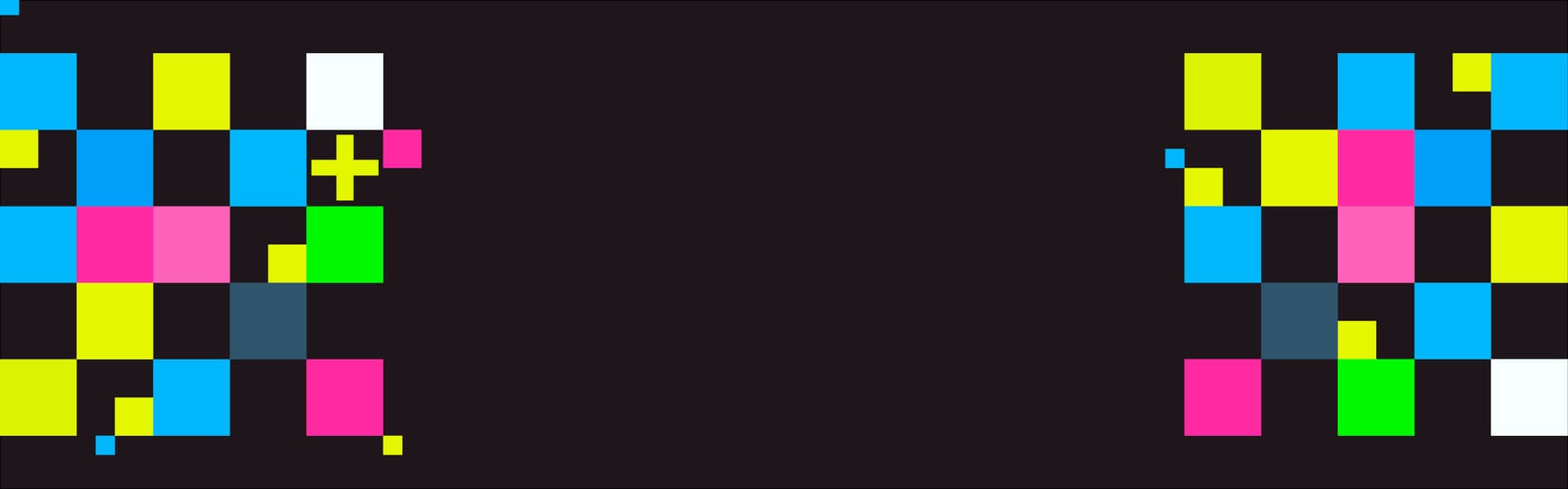
Brand Block
svg
Plus Symbol
svg

Title Banner
svg

Banner Mosaic
svg
© 2026 Rekt. All rights reserved.